Simple Sign

Parking Made Simple

Introducing simpleSign, a new system of signage to help visitors and citizens in LA understand parking rules in a single glance.

Academic Project

Class

Interaction Design Studio I

Year

2022

Role

Team Leader, Website UI design, Video Director + Editor, Research & Development

Team

Lisa Skibinskaya, Sofia Nilsson, Mahabala Orlov

Overview

Problem

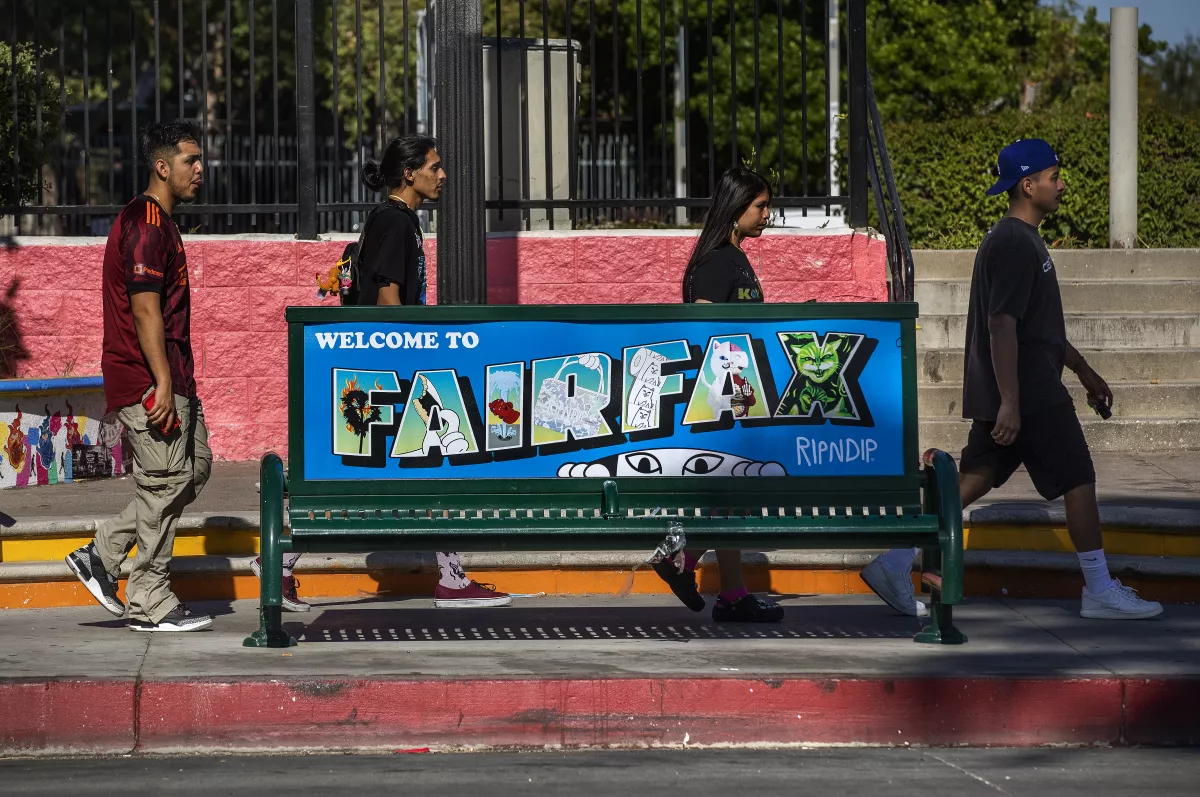
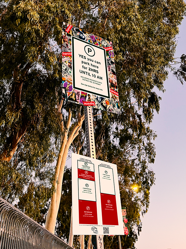
Melrose & Fairfax is a super trendy shopping district with tons of visitors flocking to shop at its unique locations from all over the world. However, parking in the area is extremely limited: there are no large parking garages limiting visitors to street parking only, which is highly regulated due to the residential areas that surround it. This difficulty in parking leads to thousands of parking tickets and unhappy visitors year after year.


Insight

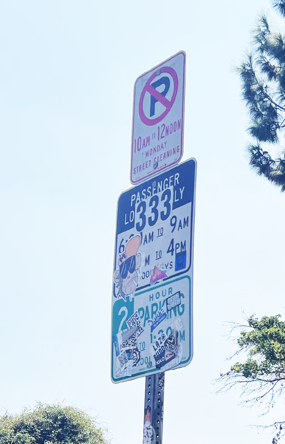
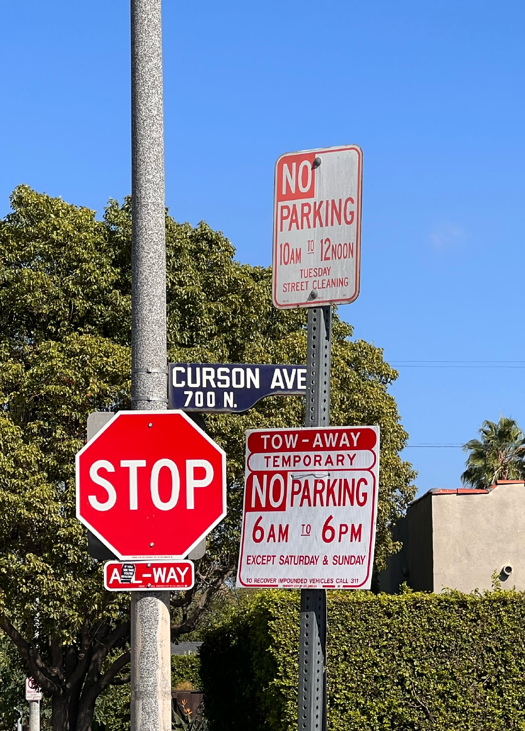
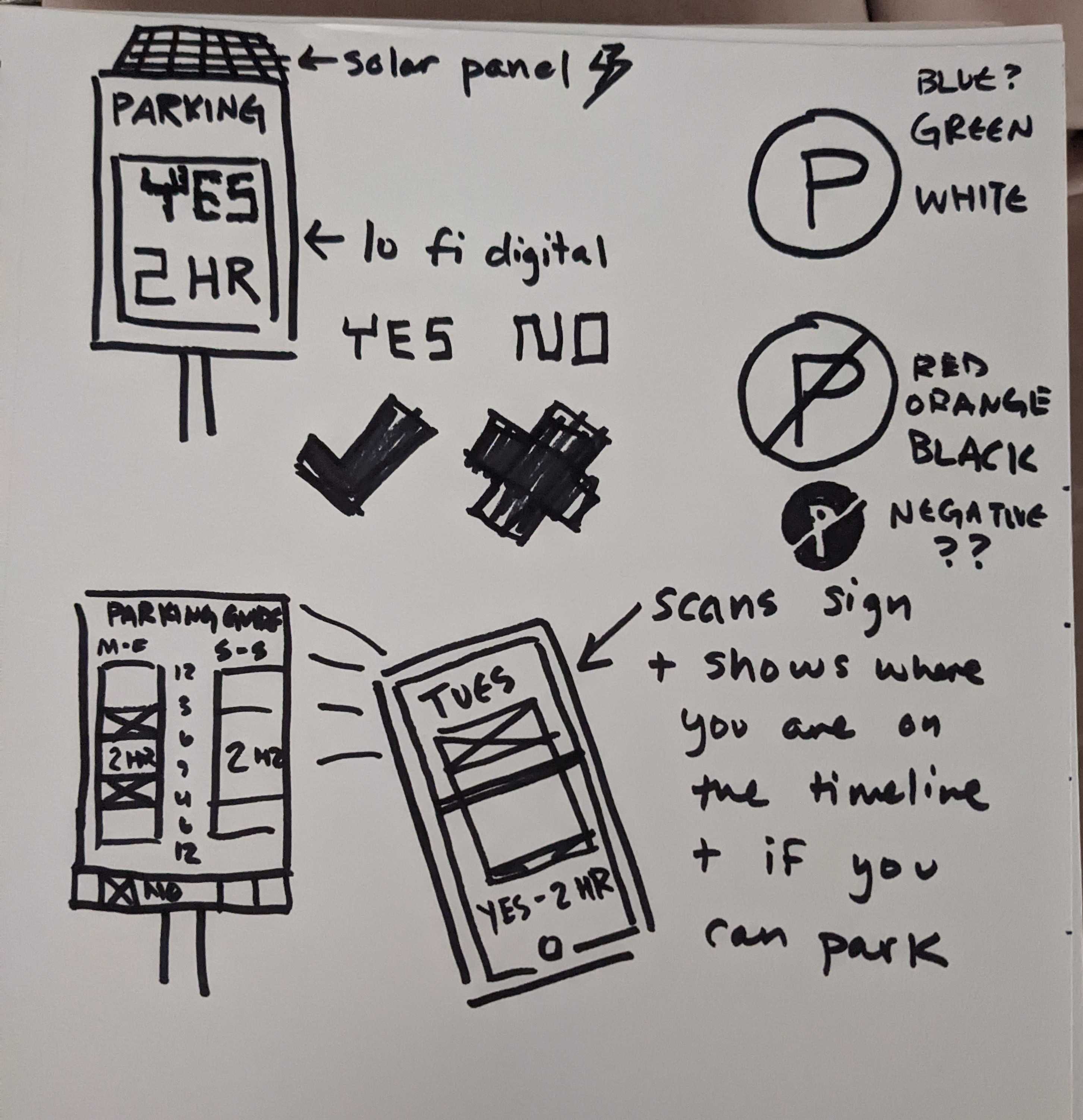
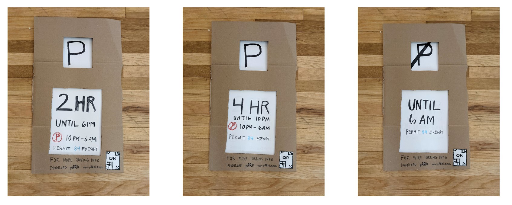
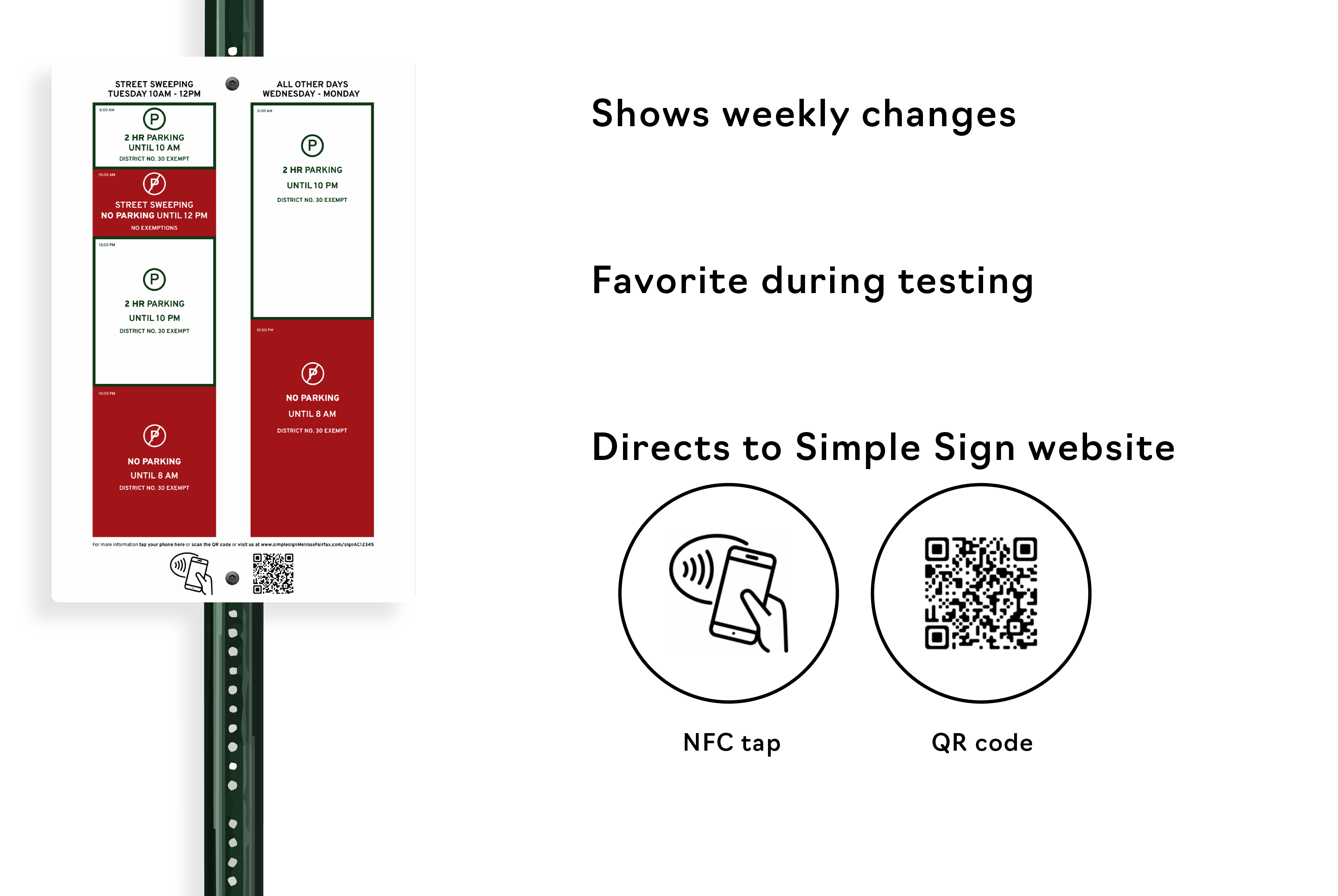
During interviews with visitors and workers in the area, we discovered that one of the main issues with parking is confusion about signage. We did a lot of research into parking signage and what makes it so confusing, and what can possibly be done to help.


Solution

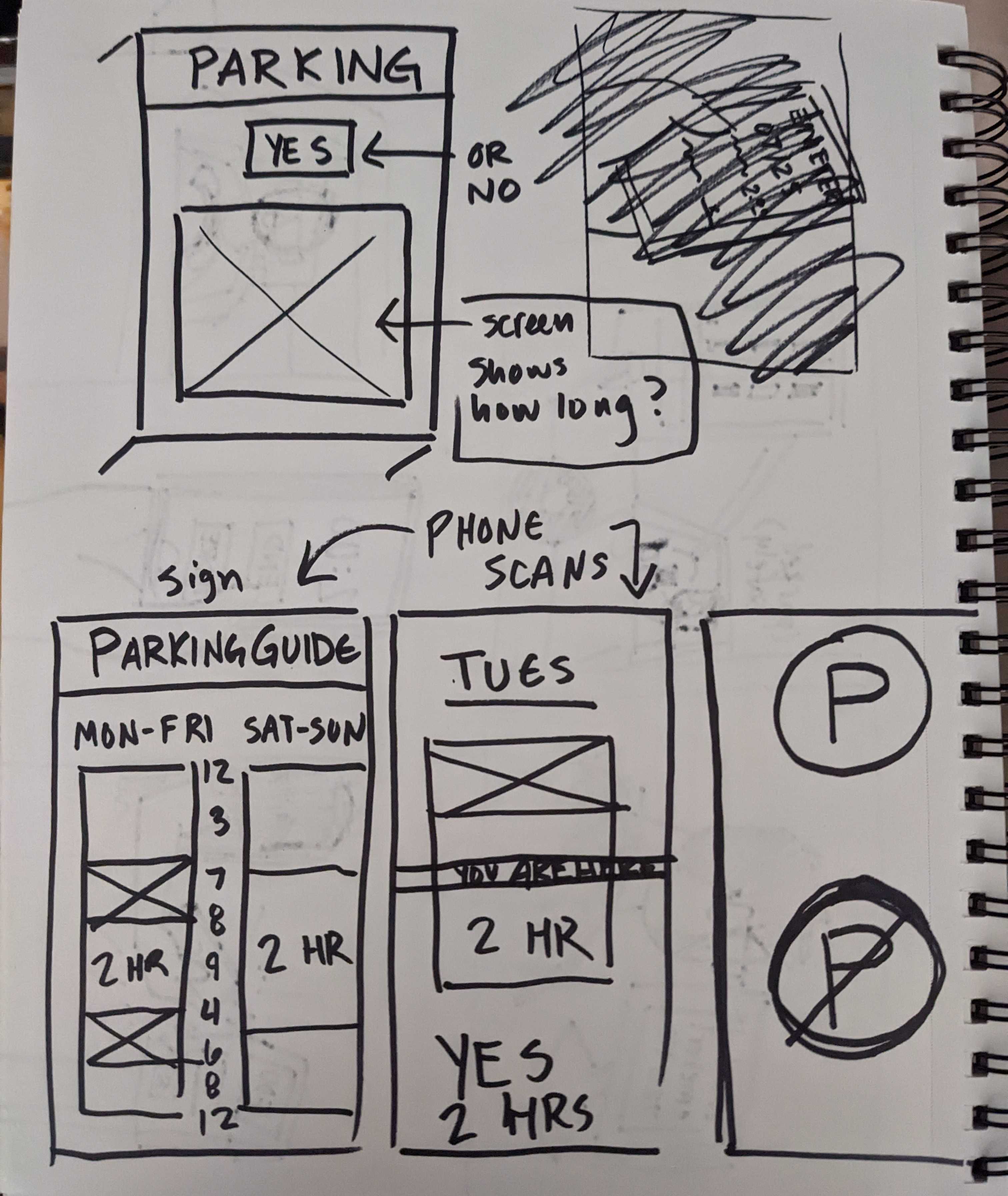
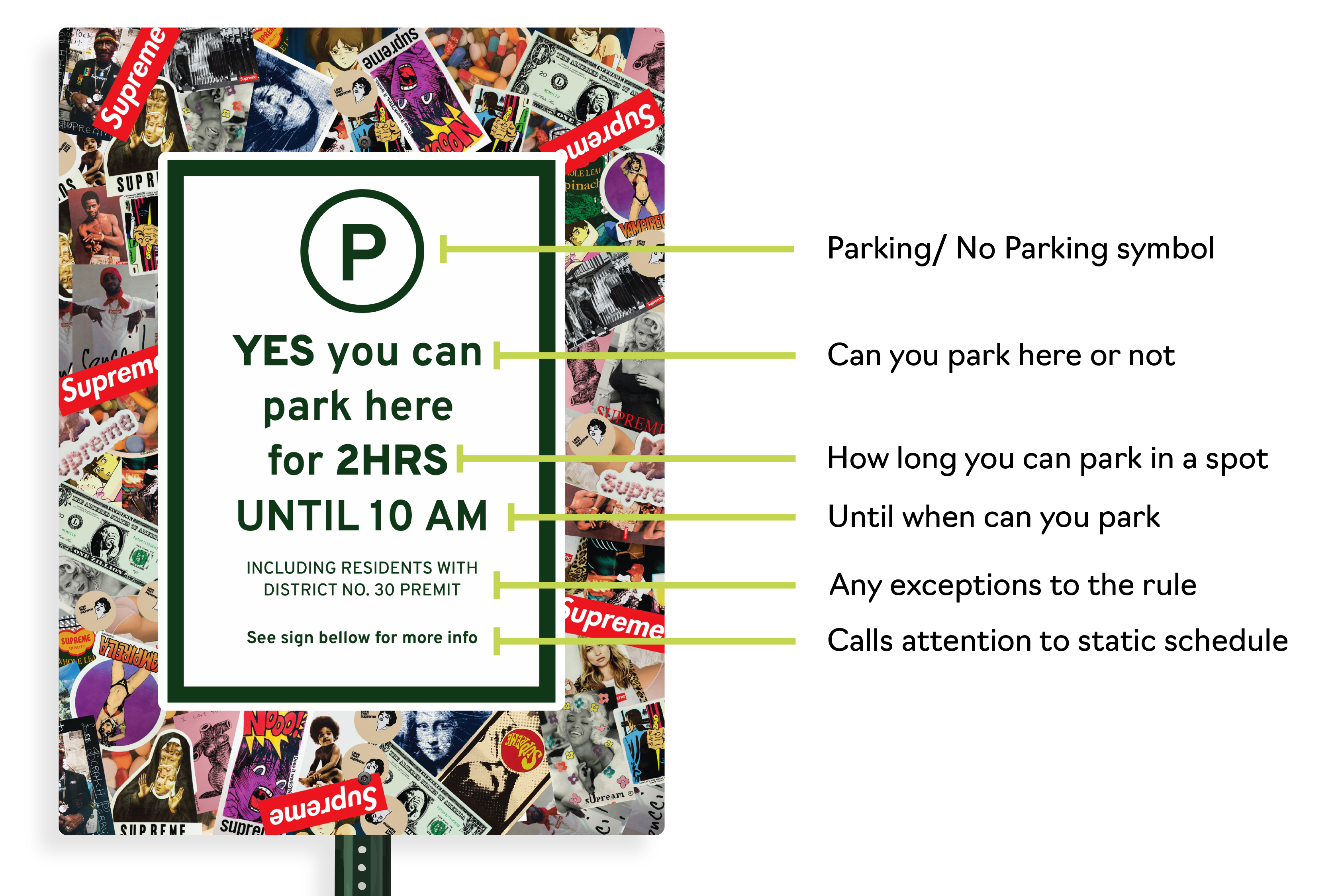
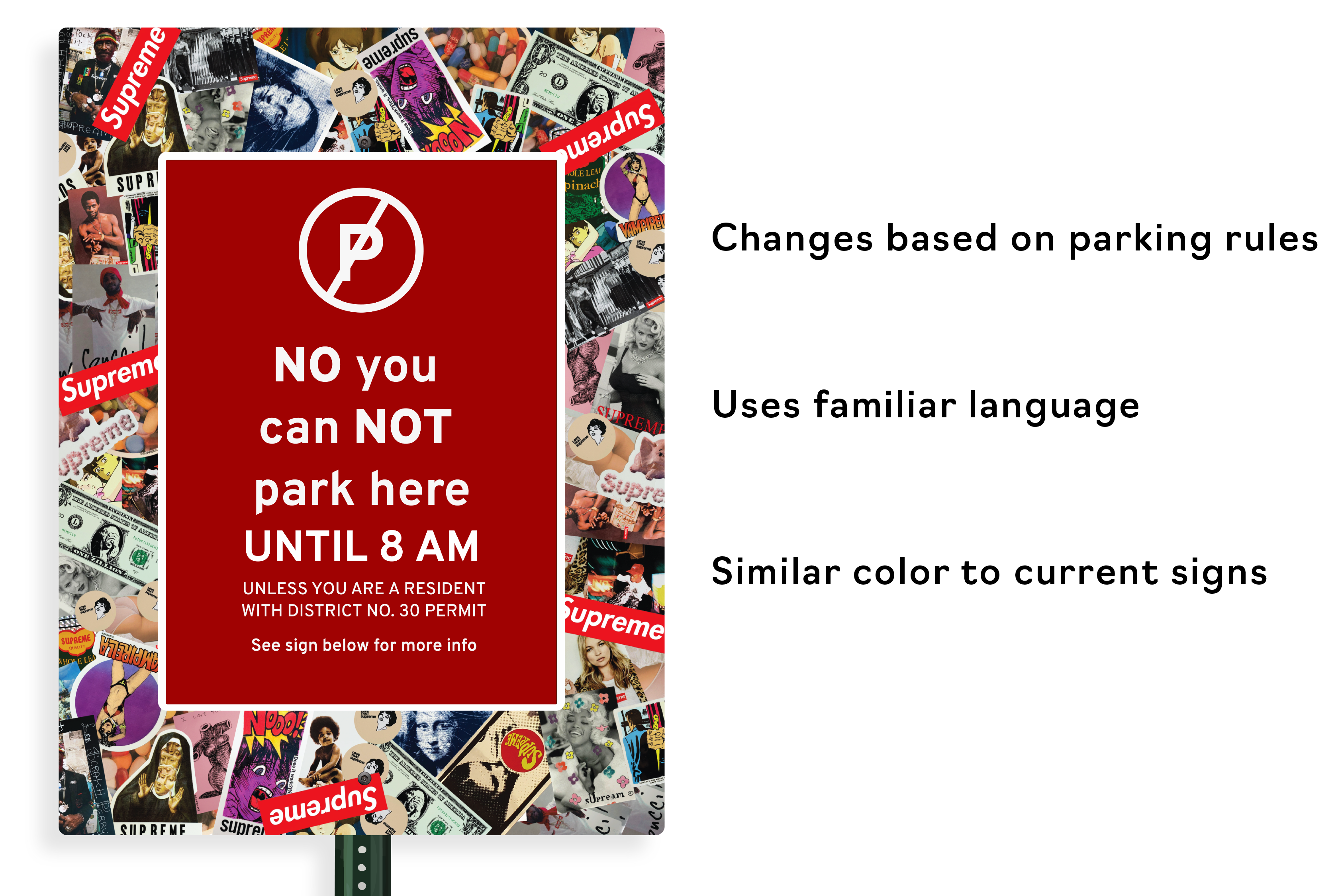
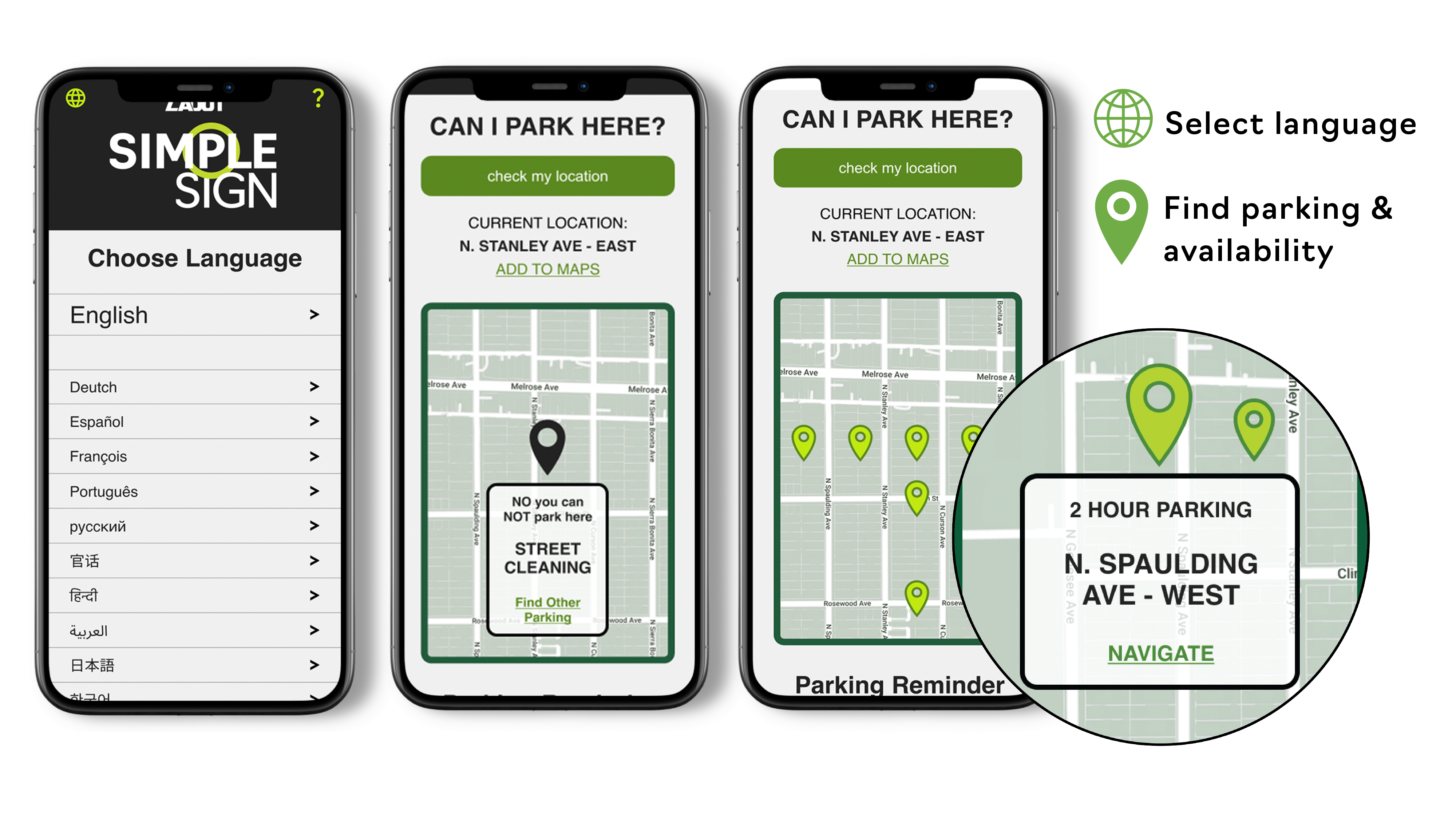
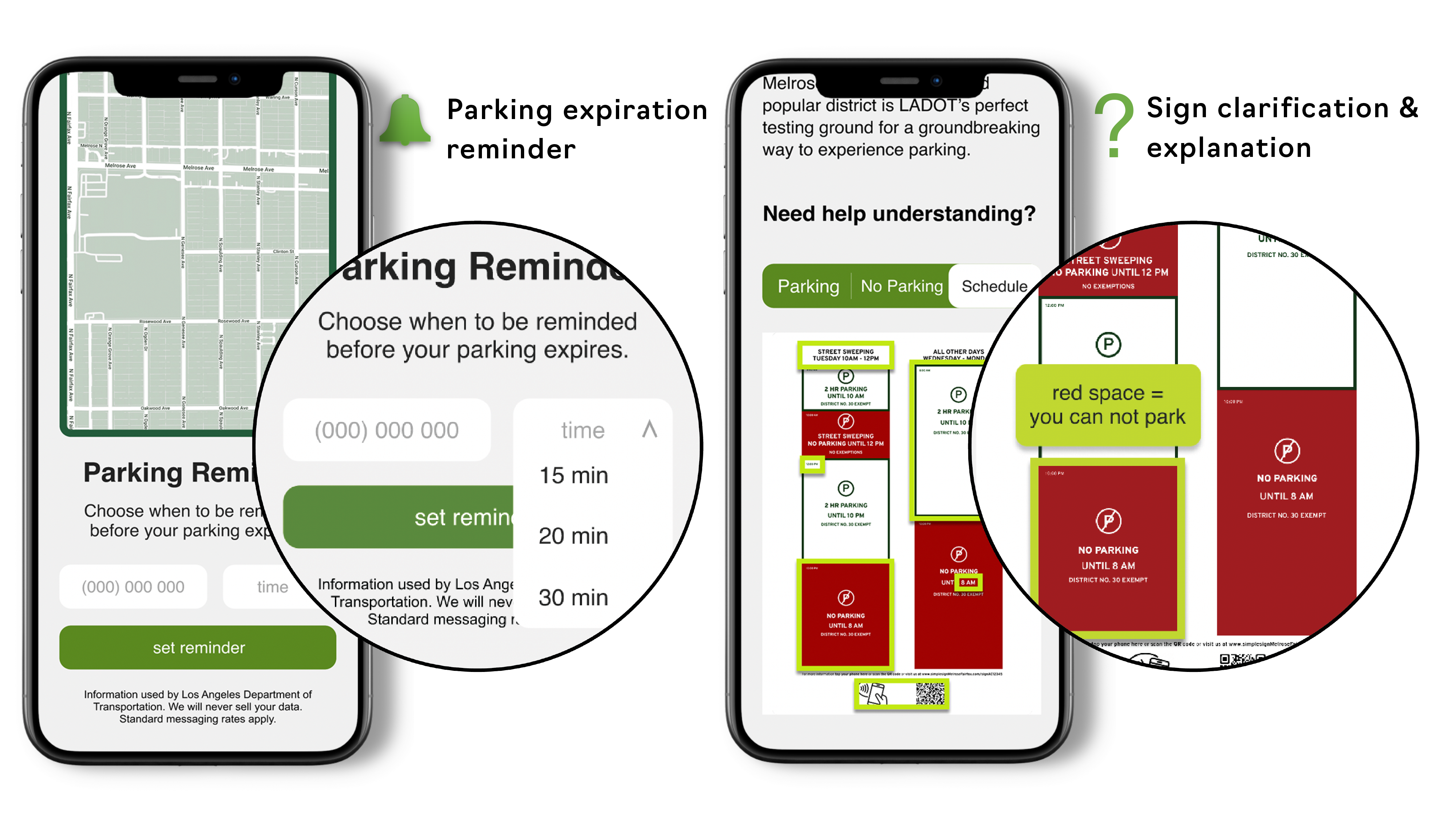
simpleSIGN is parking signage for a new era. Its use of technology allows visitors in the area to understand parking rules at a glance, and its assistant website allows for even more flexibility in interpreting parking rules, including a language translator, a legend of the signage, assistance in finding additional parking, and a timer to avoid those pesky 2-hour time limits.


How might we help visitors coming to Fairfax & Melrose quickly & easily understand when and where they can and cannot park?

Fairfax & Melrose

Fairfax & Melrose is one of the most popular shopping districts centrally located in Los Angeles. The area is primarily residential, however, making it hard for visitors to find parking in the heavily visited area where most available parking is on residential streets. We interviewed several people both shopping and working in the area.


"It has the most confusing and contradictory signs, sometimes I don’t know if I can park here at all."

-Monica, visitor

"I’ve been working here for years, some people on the block have worked here for even longer, and we still don’t understand all the parking rules."

-Monai, Barista

Illegibility

Multiple Layers

Unclear Rules

Common Issues

After conducting field research and interviews we found the most significant issue was dealing with parking signs. Many signs are illegible from being defaced, have unclear rules with posted signs that may be contradictory, or an overwhelming amount of signage that seems too difficult to interpret.

Concept Sketches

With the heady idea of redesigning signage, we took to sketching. One of the main factors that we found to be important was dealing with symbolism and color, and trying to decipher what were the most universal ways to communicate “yes you can park here” or “no, you can’t park here.” We played around with the idea of a digital sign early, something that could change throughout the day. Another idea we had was a schedule sign with an assistant AR app that could quickly decipher the signage for you. There were lots of different ways to approach this problem!

Prototyping

We ended up prototyping a cardboard version of a digital sign that would change throughout the day (pictured above), as well as a schedule sign that we could test and see which users preferred.

User Feedback & Testing

Feedback was mixed – some people liked the digital sign where some people liked the static, schedule sign. The digital sign had the strength of being immediately understood at a glance, which was what inspired us to redesign signage in the first place: to simplify it as much as possible. However, there were several things that the digital sign could not necessarily take into consideration quickly and easily: things like when street cleaning would occur. But mostly, the mixed reception & eagerness for both ideas left us conflicted. So we decided… why not have both?

DIGITAL SIGN

The digital sign is made to be noticed easily from a moving car and deciphered in a single glance with the use of color: white and green for parking availability, and red for parking unavailability. The language is also as clear as possible pertaining to when the rules will change and who is exempt. It would change accordingly throughout the day.

One of the main issues we observed was parking signs in the Melrose/Fairfax area were often rendered unreadable because of graffiti or stickers covering up vital information. We decided to add space around the sign to A) make space for people to put their stickers up, and B) to offer as advertising real estate, the revenue of which could be used to make up for the lost money from all the parking tickets simpleSIGN would curb.

STATIC SIGN

Posted beneath the digital sign at eye-level would be the static schedule. Almost all of the users we tested were enthusiastic about this sign and its use of visuals instead of text to convey when parking would be available throughout the day. It also allows for a visitor to plan their parking ahead if they see a full schedule for the day quickly and easily. It would also advertise and offer quick navigation to the simpleSIGN website!

Website

One of the most important things to us was making sure that simpleSIGN could be universally understood without language barriers. Our first idea for the website was making sure everything could be easily changed into multiple languages, allowing for easy navigation. We would also offer a parking guide that could tell you if the street you’re on is currently suitable for parking, and if it isn’t, could allow you to see the nearest available parking and navigate to it through your phone’s map application.

Website cont.

As most streets in the Fairfax/Melrose district have a time limit for parking, we thought it would be nice to also offer a parking reminder feature that could alert the user when their parking was about to expire, to further avoid receiving parking tickets. Additionally there would be a legend on the website for the signage, allowing users to even further interpret what they see before them and avoid all confusion.

Reflection

It is clear as we approach a more technological future that we, as interaction designers, can try to improve upon our societal structures to make them as accessible as possible. simpleSIGN seeks to make signage easily understood by all, and could be easily applied to multiple cities with similar problems to the Melrose/Fairfax district in LA.

I learned a lot on this project about the product design process. I would say the insight I gained from user interviews and our preliminary research on the street helped me the most–actually getting my feet on the ground and talking to people who faced this problem on a daily basis helped me realize the necessity of redesigning signage. It was also fun to consider digitizing and redesigning something as basic as a parking sign, with simplicity being our main tenet. .

^